Welcome, creators! You've successfully built a dedicated following on Telegram, but are you maximising its potential? Turning engaged followers into paying members requires a crucial, often overlooked, tool: a high-converting landing page. This single page is your digital storefront, your 24/7 salesperson, and the most critical step in your monetisation journey. Generic advice simply won't cut it. To succeed in today's competitive creator landscape, you need specific, actionable strategies tailored to your unique business model.
This guide provides an in-depth roundup of the 10 most impactful landing page design best practices. We'll move beyond the obvious, offering practical steps and fresh perspectives to help you build pages that captivate, convince, and convert your audience. The principles outlined here are fundamental for anyone looking to build a robust sales funnel.
Whether you're using a powerful tool like MyMembers to streamline your membership setup or building a page from scratch, these insights will form the foundation for sustainable growth. By implementing these proven techniques, you will learn how to:
- Clarify your offer with a single, compelling value proposition.
- Guide user action with irresistible calls-to-action (CTAs).
- Build credibility using powerful social proof and trust signals.
- Optimise for performance to ensure a seamless user experience on any device.
Get ready to transform your passion into a profitable enterprise. Let's dive into the strategies that will turn your Telegram audience into a thriving, member-supported business.
1. Single, Clear Value Proposition
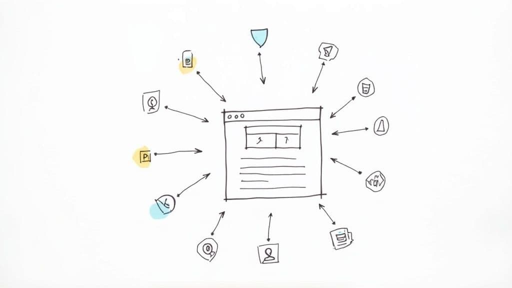
A value proposition is the cornerstone of your landing page. It's a clear, concise promise of the value a visitor will receive from your membership, course, or service. It must immediately answer their unspoken question: "What's in it for me, and why should I choose this over anything else?" One of the most critical landing page design best practices is ensuring this message is singular and powerful, avoiding the temptation to list every feature you offer.
828577ec-130a-475e-a435-5befbc4cc323.jpg
This focused approach, popularised by Lean Startup principles, forces you to distil your offering to its core benefit. For a fitness coach, instead of "Workouts, meal plans, and community support," a stronger value proposition might be: "Achieve your fitness goals faster with a plan that fits your life." The first is a list of features; the second is a compelling outcome.
Why It's a Crucial First Step
Your value proposition is often the first text a visitor reads, making it a key factor in their decision to stay or leave. A strong one grabs attention, communicates relevance, and sets the stage for the rest of your page. It differentiates you from competitors and instantly aligns your offering with your ideal customer's needs, reducing bounce rates and increasing engagement.
How to Implement It in MyMembers
Crafting the perfect value proposition requires a deep understanding of your audience.
- Focus on Outcomes: Don't sell the "online course"; sell the "career transformation." Don't sell the "Telegram group"; sell the "exclusive access to expert trading signals."
- Use Customer Language: Dive into your community chats, survey responses, and testimonials. Use the exact words and phrases your members use to describe their problems and desired results.
- A/B Test Your Message: Use analytics to test different value propositions. Does "Master digital art" convert better than "Create stunning art, even as a beginner"? Let the data guide you.
Key Insight: Your value proposition isn't for you; it's for your customer. It should resonate with their deepest desires or solve their most pressing problem in ten words or less.
2. Compelling Call-to-Action (CTA)
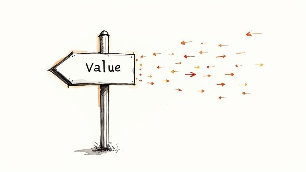
Once your value proposition has captured a visitor's attention, the call-to-action (CTA) is the crucial next step. A CTA is the button or link that guides your visitor towards conversion, prompting them to take a specific, desired action. This is one of the most vital landing page design best practices because even the most persuasive page is useless without a clear path for the user to follow.
c5351d76-bc1c-47e3-947a-3d8e4ae39a7f.jpg
Pioneered by direct response marketers and perfected by conversion optimisation experts, an effective CTA uses action-oriented language, creates a sense of urgency, and stands out visually. Instead of a generic "Submit," compelling CTAs like Netflix's "Get Started" or Spotify's "Try Premium Free" focus on the value the user receives. They reduce friction by clearly communicating what happens next and lowering the perceived commitment.
Why It's a Crucial Conversion Driver
Your CTA is the gateway to your membership, course, or community. A weak, hidden, or confusing CTA will cause hesitation and lead to abandoned pages, no matter how good the rest of your content is. A strong CTA, however, provides a clear, frictionless instruction that makes it easy for visitors to say "yes." It's the final handshake that turns a prospect into a member.
How to Implement It in MyMembers
Optimising your CTA button can dramatically increase your sign-up rate.
- Use Action-Oriented, First-Person Language: Instead of a passive "Sign Up," try a more personal and benefit-driven "Get My Free Trial" or "Join the Community." This frames the action from the user's perspective.
- Design for Visibility: Your CTA button must stand out. Use a contrasting colour that draws the eye, ensure it's large enough to be easily tapped on mobile (at least 44x44 pixels), and use generous whitespace around it to prevent visual clutter.
- Place it Strategically: Ensure a CTA is visible above the fold (without scrolling) for visitors who are ready to convert immediately. Repeat the CTA further down the page for those who need more information before committing.
Key Insight: A great CTA isn't just a button; it's the culmination of your entire landing page's argument. It should feel like the natural and obvious next step for your visitor to take.
3. Mobile-First Responsive Design
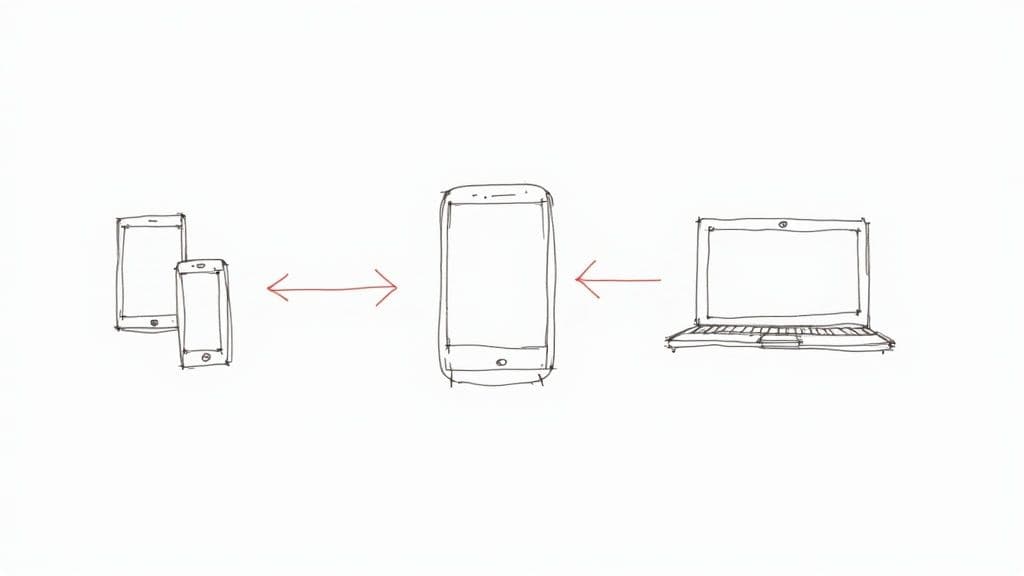
In today's digital landscape, assuming your audience is on a desktop computer is a critical mistake. Mobile-first responsive design flips the traditional approach on its head. Instead of designing for a large screen and then shrinking it down, you design for the smallest screen first and then adapt it for larger devices. This is one of the most vital landing page design best practices because, for many creators, the majority of traffic from social media and messaging apps like Telegram will be on mobile.
cbf90c0f-9232-4a34-a06f-582dd388325f.jpg
This methodology, championed by experts like Luke Wroblewski, forces you to prioritise what truly matters. On a small screen, there's no room for fluff. You must focus on the core message and the primary call-to-action, ensuring a seamless experience for the largest segment of your audience. Think of Amazon's mobile site, where the path to purchase is incredibly streamlined and simple.
Why It's a Non-Negotiable Practice
A poor mobile experience is a guaranteed way to lose potential members. If your landing page is slow, difficult to navigate, or requires pinching and zooming, visitors will leave instantly. A mobile-first approach directly addresses this by ensuring fast load times, touch-friendly navigation, and legible text. Furthermore, Google's mobile-first indexing means a high-quality mobile site is essential for search engine visibility, making it a cornerstone of modern SEO.
How to Implement It in MyMembers
Building a mobile-optimised landing page requires a specific mindset and toolset.
- Prioritise Ruthlessly: Place your value proposition and main CTA "above the fold" on a mobile screen. Anything that isn't essential to the conversion goal should be moved further down the page or removed entirely.
- Design for Thumbs: Ensure buttons and clickable links are large enough and have sufficient spacing to be easily tapped without accidental clicks. Use a single-column layout for the main content flow.
- Optimise for Speed: Compress images and use mobile-friendly formats. Every second of loading time on a mobile network can lead to a significant drop-off in conversions. Test your page on real devices, not just browser simulators, to get an accurate feel for performance.
Key Insight: Don't just make your desktop page fit on a mobile screen. Design an experience that feels native and intuitive to a mobile user from the very first tap.
4. Social Proof and Trust Signals
Social proof leverages a powerful psychological principle: people look to the actions and opinions of others to guide their own decisions. Trust signals, such as customer testimonials, reviews, and security badges, work in tandem to reduce a visitor's perceived risk and build credibility. For a creator launching a new membership or course, establishing this trust is one of the most vital landing page design best practices to convert sceptical visitors into loyal members.
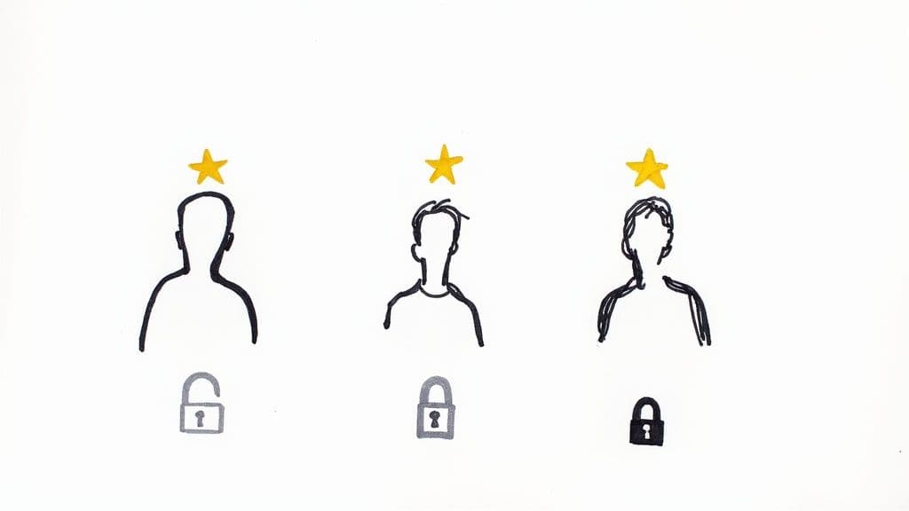
4668cfee-f037-438e-80ca-725852fea47b.jpg
Popularised by Dr. Robert Cialdini in his seminal book Influence, this concept is the reason we check reviews on Amazon or choose a busy restaurant over an empty one. For digital products, social proof acts as a digital seal of approval, showing prospective customers that others have invested in your offering and found it valuable. It transforms your landing page from a simple sales pitch into a credible, peer-endorsed solution.
Why It's a Crucial Conversion Driver
When a visitor lands on your page, especially for the first time, they are inherently cautious. They are asking themselves, "Can I trust this person?" and "Will this actually work for me?". Social proof directly answers these questions by showcasing the positive experiences of past and current members. It provides objective, third-party validation that calms fears, dismantles objections, and makes the decision to join feel safer and more logical.
How to Implement It in MyMembers
Effectively weaving social proof into your landing page involves more than just adding a generic quote.
- Showcase Specific Results: Instead of "Great course!", use testimonials that detail a specific outcome, like "I gained 1,000 engaged followers in 30 days using the strategies from Module 2."
- Use Real Identities: Add photos and full names (with permission) to your testimonials. This makes the praise feel more authentic and relatable. A face adds a powerful human element.
- Display Key Numbers: Feature impressive statistics prominently. "Join 500+ members already transforming their fitness" is more compelling than just "Join our community."
- Leverage Video Testimonials: A short video of a happy member sharing their success story can be incredibly persuasive, combining visual and emotional impact for maximum effect.
Key Insight: The best social proof doesn't just say your offer is good; it proves it by showing real people achieving real, desirable results. It moves the focus from your claims to your customers' success.
5. Minimal Distractions and Focused Design
A focused design philosophy is about subtraction. It involves strategically removing any element that does not directly contribute to the visitor's understanding of your offer or guide them toward the conversion goal. This core principle of landing page design best practices combats decision fatigue by eliminating unnecessary navigation links, sidebars, and competing calls-to-action. The aim is to create a frictionless, linear path from arrival to conversion.
Inspired by the minimalist principles of designers like Dieter Rams and famously executed by companies like Apple, this approach centres on clarity. By using generous whitespace, a limited colour palette, and a strong visual hierarchy, you reduce cognitive load. This ensures your value proposition and primary call-to-action remain the undisputed heroes of the page, making it easier for visitors to make the one decision you want them to make.
Why It Creates a Clear Path to Conversion
In a noisy digital world, simplicity is a competitive advantage. A landing page cluttered with links and options gives visitors too many "escape routes," pulling them away from your primary goal. A focused, minimalist design keeps them on track, guiding their attention deliberately through your sales argument. This clarity builds trust and confidence, making the decision to join your membership or buy your course feel simple and logical.
How to Implement It in MyMembers
Applying a focused design is about ruthless prioritisation of your page elements.
- Remove the Main Navigation: Your landing page has one job. Don't offer links to your "About Us" page, blog, or other services. Hide or completely remove the standard website navigation menu to keep users focused on the offer at hand.
- Embrace Whitespace: Don't crowd elements together. Use ample space around your headlines, images, and buttons. This negative space helps to draw the eye to key information and makes your content more readable.
- Stick to One Primary CTA: While you may repeat the CTA button down the page, ensure the action is always the same. Avoid offering a primary "Buy Now" button alongside a secondary "Learn More" or "Download Free Guide" button that could fracture a user's attention.
Key Insight: Every element on your landing page should answer "yes" to one question: "Does this help my visitor make a conversion decision?" If the answer is no, remove it. This focus not only improves conversions but also keeps members engaged from their very first interaction.
6. Fast Loading Speed Optimisation
In today's fast-paced digital world, patience is in short supply. Page loading speed is not just a technical metric; it is a core component of the user experience and directly impacts your conversion rates. Research from Google and Amazon has shown that even a one-second delay can cause a significant drop in conversions. For creators, this means a slow page can be the single biggest obstacle between a potential member and a sale, making landing page design best practices incomplete without a focus on speed.
Optimising for speed involves a series of technical improvements designed to deliver your page content to a visitor's browser as quickly as possible. This includes compressing images, minimising code, and using smart loading techniques. Think of it as ensuring the path to your offer is clear, smooth, and immediate, removing any frustrating waits that might cause a visitor to abandon their journey.
Why It's a Crucial Conversion Factor
Your landing page has mere seconds to make an impression. A slow-loading page creates a poor first impression, suggesting a lack of professionalism and leading to high bounce rates. Search engines like Google also prioritise fast-loading websites in their rankings. A crucial aspect of speed optimisation involves understanding and improving your Core Web Vitals, which are direct ranking factors. A faster page not only keeps users engaged but also improves your visibility in search results.
How to Implement It in MyMembers
Ensuring your MyMembers landing page is lightning-fast doesn't require you to be a web developer. You can achieve significant improvements with a few focused actions.
- Optimise Your Images: Images are often the biggest culprits for slow load times. Use tools like TinyPNG or Squoosh to compress your images before uploading them. Choose modern formats like WebP where possible, as they offer superior compression and quality compared to traditional JPEGs.
- Implement Lazy Loading: This technique only loads images and videos when they are about to enter the visitor's viewport. This means the initial page load is much faster, as it doesn't have to load every single media file at once.
- Keep It Simple: The more elements, scripts, and third-party integrations you add, the more HTTP requests your page has to make, slowing it down. Evaluate every element on your page and remove anything that isn't absolutely essential to your conversion goal.
Key Insight: Page speed is a reflection of your respect for the user's time. Aim for a load time under three seconds to ensure you capture attention and keep potential customers on the path to conversion.
7. Clear Information Hierarchy
Information hierarchy organises content by importance, guiding visitors through your page in a logical, intuitive sequence. It uses headings, subheadings, bullet points, and visual cues to create a scannable structure that a user can understand at a glance. For creators, this is one of the most fundamental landing page design best practices because it ensures your most persuasive points are seen first, preventing potential members from getting lost or overwhelmed.
This principle, championed by information architecture experts like Louis Rosenfeld and UX pioneers at the Nielsen Norman Group, is about designing for clarity. Just as a well-organised shop guides customers to the products they need, a well-structured landing page guides visitors from understanding your value to taking action. Think of HubSpot's or Mailchimp's pages, where clear sections and visual dividers make complex offerings easy to digest.
Why It's Crucial for Conversion
Without a clear hierarchy, your landing page is just a wall of text and images. Visitors won't know where to look first or what information is most critical, leading to confusion and high bounce rates. A strong hierarchy directs attention, highlights key benefits, and builds a compelling narrative that moves the user logically towards your call-to-action, making the decision to join feel natural and easy.
How to Implement It in MyMembers
Building an effective information hierarchy is about strategic content placement.
- Use the Inverted Pyramid: Place your most critical information, like your main value proposition and primary benefit, at the very top of the page. Less crucial details, like FAQs or your 'About Me' section, should follow further down.
- Create Scannable Content: Break up text with short paragraphs (2-3 sentences), bold keywords, and bulleted lists. This allows visitors to quickly scan and absorb key points without having to read every word.
- Group Related Information: Keep similar content together. For instance, group all your testimonials in one section and all the details about your course modules in another. Use consistent spacing and typography to visually separate these sections. To dive deeper into page structure, you can learn more about building a high-converting website.
Key Insight: Your page should tell a story. The hierarchy is the plot, guiding the reader from the hook (your value proposition) to the climax (the call-to-action) in a clear, compelling order.
8. A/B Testing and Optimisation
Even with the best intentions, you can't be certain what will truly resonate with your audience without data. A/B testing, also known as split testing, is the process of comparing two versions of a webpage element to see which one performs better. By showing version 'A' to one group of visitors and version 'B' to another, you can definitively measure which one leads to more sign-ups, sales, or clicks. This data-driven approach is a cornerstone of effective landing page design best practices, removing guesswork from your optimisation efforts.
A famous example is Barack Obama's 2008 campaign, which used A/B testing on their landing page to find the best combination of media and button text. The winning variation increased sign-ups by a massive 40.6%. This highlights that small changes, validated by testing, can lead to monumental improvements in conversion rates. The goal is continuous, incremental improvement based on real user behaviour, not just assumptions. For a deeper dive into improving your website's performance and turning more visitors into customers, consider focusing on website conversie optimalisatie.
Why It's a Crucial Optimisation Step
Without testing, your landing page design is based on intuition alone. A/B testing provides the empirical evidence needed to make informed decisions that directly impact your bottom line. It allows you to understand your audience's preferences on a granular level, from which headline captures their attention to which button colour compels them to act. This process of continuous refinement ensures your page evolves to become as effective as possible, maximising the return on your traffic-generating efforts.
How to Implement It in MyMembers
Integrating A/B testing into your workflow is a powerful way to boost your membership or course sales.
- Test One Element at a Time: To get clear, unambiguous results, change only one variable per test. For example, test your main headline or your CTA button text, but not both simultaneously.
- Focus on High-Impact Elements First: Start by testing the elements most likely to affect conversions: your value proposition, primary call-to-action (CTA) button, hero image, or the main offer itself.
- Ensure Statistical Significance: Don't end a test too early. Use an A/B testing tool or calculator to ensure you have a large enough sample size to trust the results. Testing for at least one full week is a good starting point.
- Document Everything: Keep a log of every test you run, including your hypothesis, the variations, the results, and what you learned. This document becomes an invaluable resource for future campaigns.
Key Insight: A/B testing isn't about finding a single "perfect" page; it's about fostering a culture of continuous improvement. Each test provides a valuable lesson about your audience that you can apply across all your marketing.
9. Benefit-Focused Copy Over Features
It’s a common mistake to list the features of your membership or course, believing that more features equal more value. However, one of the most powerful landing page design best practices is to shift from a feature-led to a benefit-led approach. Features describe what your product is or does; benefits describe the positive outcome or transformation a customer will experience. Benefits answer the crucial question, "What's in it for me?"
This principle, championed by legendary copywriters like Gary Halbert and modern experts like Joanna Wiebe, is about emotional connection. Your audience isn't buying a "10-module video course"; they are buying "the confidence to land a new, higher-paying job." They aren't purchasing "access to a community Telegram group"; they are purchasing "a supportive network that holds them accountable and helps them succeed."
Why It's a Crucial Conversion Lever
People make purchasing decisions based on emotion and justify them with logic. Benefit-focused copy taps directly into your visitor's aspirations and pain points, creating an emotional resonance that a simple feature list cannot achieve. It paints a picture of a better future, making your offer feel like the essential solution to their problem, which directly boosts conversion rates.
How to Implement It in MyMembers
Translating your features into compelling benefits is a skill you can develop.
- Apply the "So What?" Test: For every feature you list, ask "So what?" Keep asking until you arrive at a core human desire. Feature: "Weekly live Q&A calls." So what? "I can get my specific questions answered." So what? "I will overcome obstacles faster and achieve my goals without getting stuck."
- Focus on Transformation: Frame your copy around the end result. Instead of "Downloadable workout PDFs," use "Get a flexible fitness plan you can take anywhere, so you never miss a workout and build momentum."
- Use Customer Language: Dig into your member feedback. How do they describe their success? Use their words to craft benefits that feel authentic and relatable. This also builds trust and can improve your customer retention strategies.
Key Insight: Your customer doesn't care about the mechanics of your service as much as they care about what it will do for them. Sell the destination, not the aeroplane.
10. Strategic Form Optimisation
Your lead capture form is the final gateway between a curious visitor and a new community member or customer. Strategic form optimisation is the art of designing this gateway to be as welcoming and frictionless as possible. It involves a delicate balance: gathering the essential information you need without overwhelming the user and causing them to abandon the process. This is a critical component of landing page design best practices, as even the most persuasive page will fail if the final step is a chore.
This approach, championed by conversion rate optimisation experts and marketing automation platforms like HubSpot, treats every form field as a potential point of friction. The goal is to strip the form down to its absolute essentials, making the sign-up process feel effortless. Instead of asking for a first name, last name, phone number, and company size, you might simply ask for an email address to get started.
Why It's a Crucial Conversion Lever
The design of your form directly impacts your conversion rate. A long, complicated, or confusing form is a major reason for page abandonment. By optimising it, you reduce user frustration and cognitive load, making it more likely that visitors will complete the desired action. This not inly increases your lead volume but also improves the initial user experience with your brand, setting a positive tone for your new member.
How to Implement It in MyMembers
Optimising your sign-up or contact form on MyMembers requires a user-centric mindset.
- Minimise Fields: Start with the absolute minimum. For a community sign-up, is anything more than an email and perhaps a first name truly necessary at this stage? You can always gather more information later.
- Use a Single-Column Layout: On mobile devices, which account for a huge portion of traffic, single-column forms are far easier to navigate than multi-column layouts. This simple change improves readability and usability.
- Implement Smart Defaults and Validation: Use clear, descriptive labels (e.g., "Your Best Email") instead of vague placeholders. Implement real-time validation to let users know immediately if there's an error, like a mistyped email format, so they can correct it without having to resubmit the entire form. Consider social login options (e.g., "Sign up with Google") to reduce friction even further.
Key Insight: Treat every form field as a cost to your user. Only add a field if the value of the information you receive outweighs the friction it adds to the sign-up process.
Landing Page Design Best Practices Comparison
| Item | Implementation Complexity 🔄 | Resource Requirements ⚡ | Expected Outcomes 📊 | Ideal Use Cases 💡 | Key Advantages ⭐ |
|---|---|---|---|---|---|
| Single, Clear Value Proposition | Moderate – requires deep customer and market understanding | Moderate – copywriting and research | Higher engagement, improved conversions, qualified audience | Products/services needing clear differentiation | Clear communication of unique benefit, reduces bounce rate |
| Compelling Call-to-Action (CTA) | Low to Moderate – design and placement focused | Low – design, testing tools | Direct conversions, guides user actions | Any landing page aiming to drive immediate action | Boosts conversion, reduces decision paralysis |
| Mobile-First Responsive Design | High – requires development and extensive testing | High – dev time, device testing | Better UX across devices, higher mobile traffic retention | Mobile-heavy traffic sites, multi-device audiences | Captures most traffic, improves SEO and bounce rates |
| Social Proof and Trust Signals | Moderate – content collection and ongoing updates | Moderate – content curation, design | Increased conversions, boosted credibility | New brands, high-risk product purchases | Builds trust, reduces purchase anxiety |
| Minimal Distractions and Focused Design | Moderate – design and content simplification | Moderate – design and copy adjustment | Reduced cognitive load, focused user attention | Complex offers needing clarity, professional brands | Improves focus, faster loading, professional appearance |
| Fast Loading Speed Optimization | High – technical expertise needed | High – dev, monitoring, tooling | Better UX, SEO improvement, increased conversions | Performance-critical sites, high traffic e-commerce | Significantly reduces bounce, improves engagement |
| Clear Information Hierarchy | Moderate – requires content planning and design | Moderate – design and content structuring | Improved readability, guides visitor flow | Content-rich pages, educational or SaaS products | Enhances comprehension, supports SEO |
| A/B Testing and Optimization | High – setup, traffic volume, analysis needed | High – tools, analytics, time | Data-driven improvements, conversion rate gains | Sites with ample traffic for statistical testing | Minimizes guesswork, continuous improvement |
| Benefit-Focused Copy Over Features | Moderate – requires understanding customer motivations | Low to Moderate – copywriting focus | Stronger emotional connection, higher conversions | Highly competitive markets, emotionally driven purchases | Improves resonance, differentiates messaging |
| Strategic Form Optimization | Moderate – design, testing, and profiling needed | Moderate – UX resources, automation tools | Increased lead capture, better data quality | Lead generation focused landing pages | Improves submission rates, enhances lead quality |
Your Blueprint for a High-Converting Creator Landing Page
We have journeyed through the ten essential pillars of creator landing page design. Think of these principles not as a checklist to be completed once, but as a continuous loop of creation, analysis, and refinement. Your landing page is a living, breathing asset for your creator business, and mastering these concepts provides you with a powerful and repeatable blueprint for success.
Moving beyond generic advice, we have established that a truly effective landing page does more than just exist; it performs a specific job with precision. It grabs attention, builds trust, and persuades visitors to take a single, desired action. This is the core philosophy behind every one of the landing page design best practices we have explored.
From Principles to Predictable Growth
Let's quickly synthesise the key takeaways. Your page must begin with a singular, powerful value proposition that instantly communicates what you offer and why it matters. This message is then activated by a compelling, unmissable Call-to-Action (CTA). These two elements form the heart of your conversion strategy.
However, in today's digital landscape, the user experience is paramount. A mobile-first, responsive design is non-negotiable, ensuring your page is flawless for the majority of your audience browsing on their phones. This seamless experience is reinforced by strategic trust signals and social proof, which act as the digital equivalent of a firm handshake, assuring potential members that they are in safe and capable hands.
To keep the user journey streamlined, a minimalist, focused design that eliminates distractions is crucial. This is complemented by optimising for lightning-fast loading speeds, as every millisecond counts towards keeping a visitor engaged. A clear information hierarchy and benefit-focused copywriting work in tandem to guide the user's eye and appeal to their motivations, not just the features you offer.
The Continuous Cycle of Optimisation
Remember, launching your page is just the beginning. The most successful creators understand that growth comes from data-driven decisions. This is where strategic form optimisation and, most importantly, a commitment to rigorous A/B testing come into play. You must constantly question, test, and measure to understand what truly resonates with your audience. This iterative process is what separates a good landing page from a great one.
Furthermore, a well-designed landing page is indispensable for maximizing the effectiveness and ROI of your paid advertising efforts. When you are investing in driving traffic, ensuring the destination is perfectly tuned for conversions is critical. For creators looking to scale, optimizing your Google Ads campaigns becomes significantly more profitable when every click is directed to a page built on these solid principles.
Ultimately, applying these landing page design best practices is about transforming your creative passion into a sustainable, revenue-generating business. It is about building a reliable engine that converts curious followers from Telegram, Instagram, or your email list into a community of loyal, paying members. This isn't just about design; it's about building a direct, resilient connection with your audience and creating a predictable foundation for your future growth.
Ready to put these best practices into action without the technical headache? MyMembers provides beautiful, no-code landing pages designed specifically for creators, with all these principles built-in. Start converting your audience into a thriving membership business today with MyMembers.